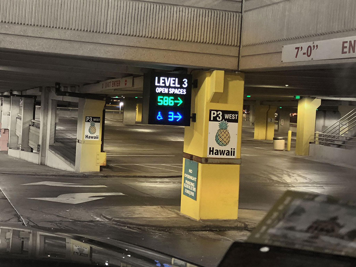
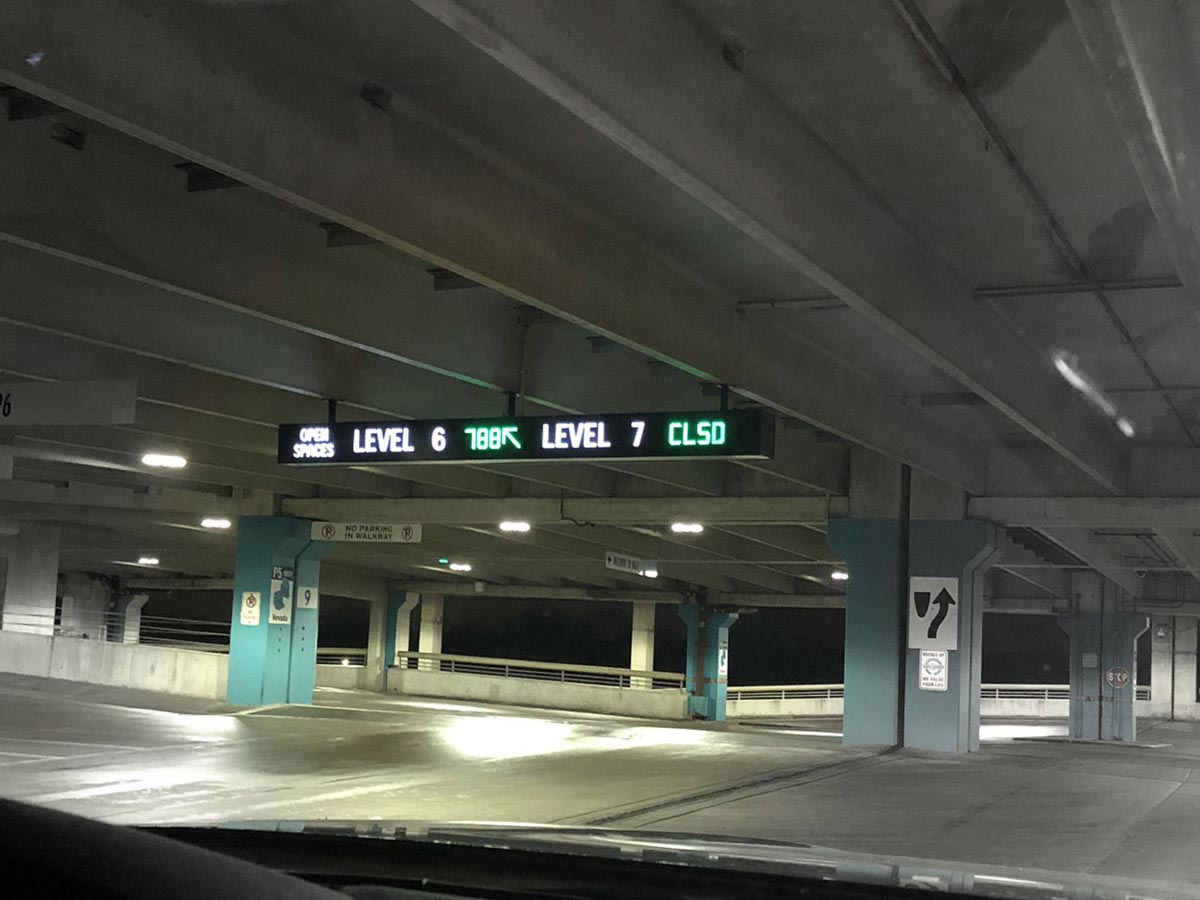
A couple of weeks ago, before the holiday shopping season officially began, I did some shopping at the Mall of America and noticed how the parking experience improved since my last visit. In my opinion, parking is pretty straightforward and organized. The design of the mall and ramps is pretty well designed and it’s easy to get on the highway after a day of shopping. However, there is a great new system with light indicators to show open parking spots at a glance that makes things even easier.


As you drive up the ramp, you’ll see how many available spots there are on each level. I’m not brave enough to venture out to the MOA on a Saturday during the holiday season, but if I were to do something wild and crazy like that, I’d probably just reserve a spot. However, this information is a great feature. When you’ve selected a level, there’s a secondary indicator that shows the open number on the level(s) above.

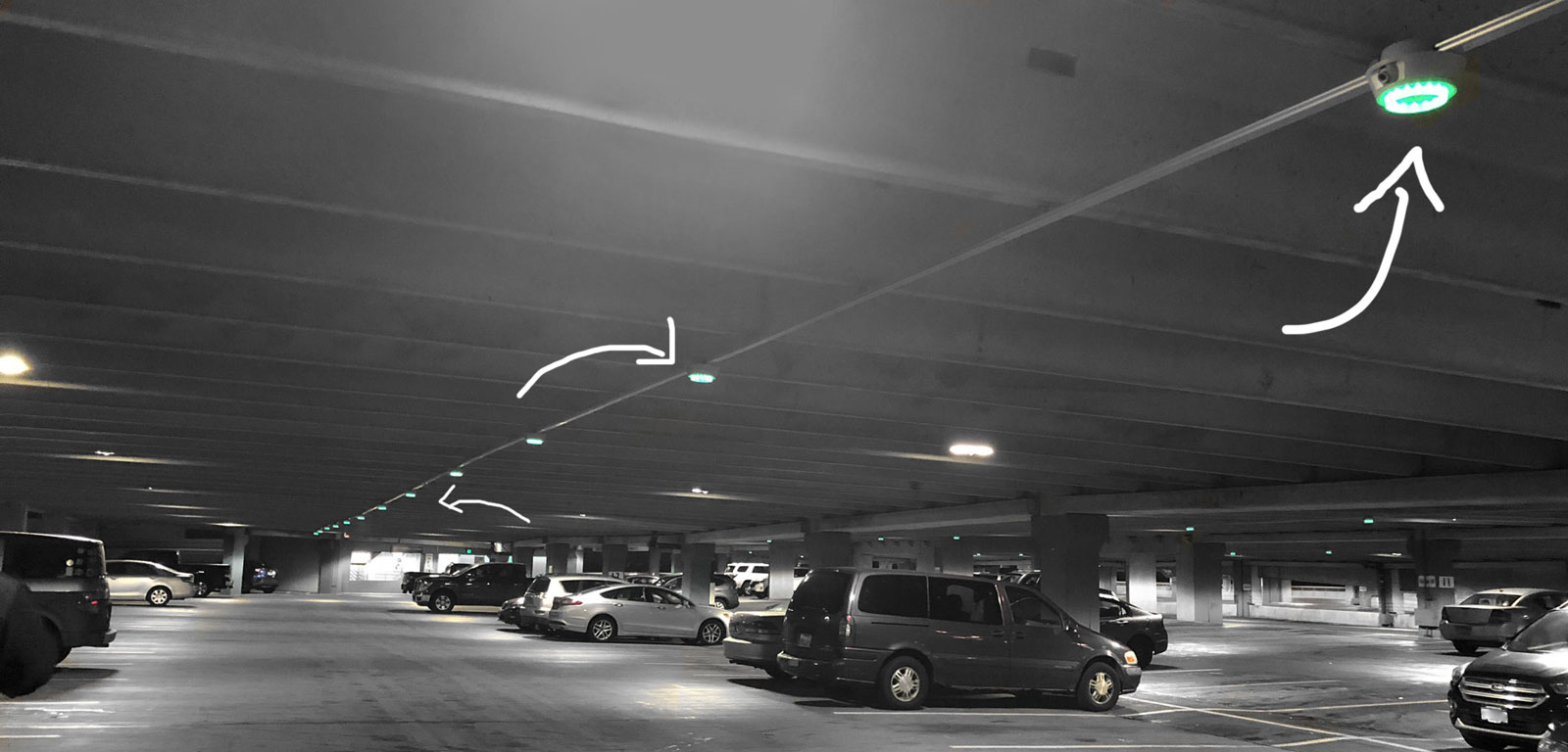
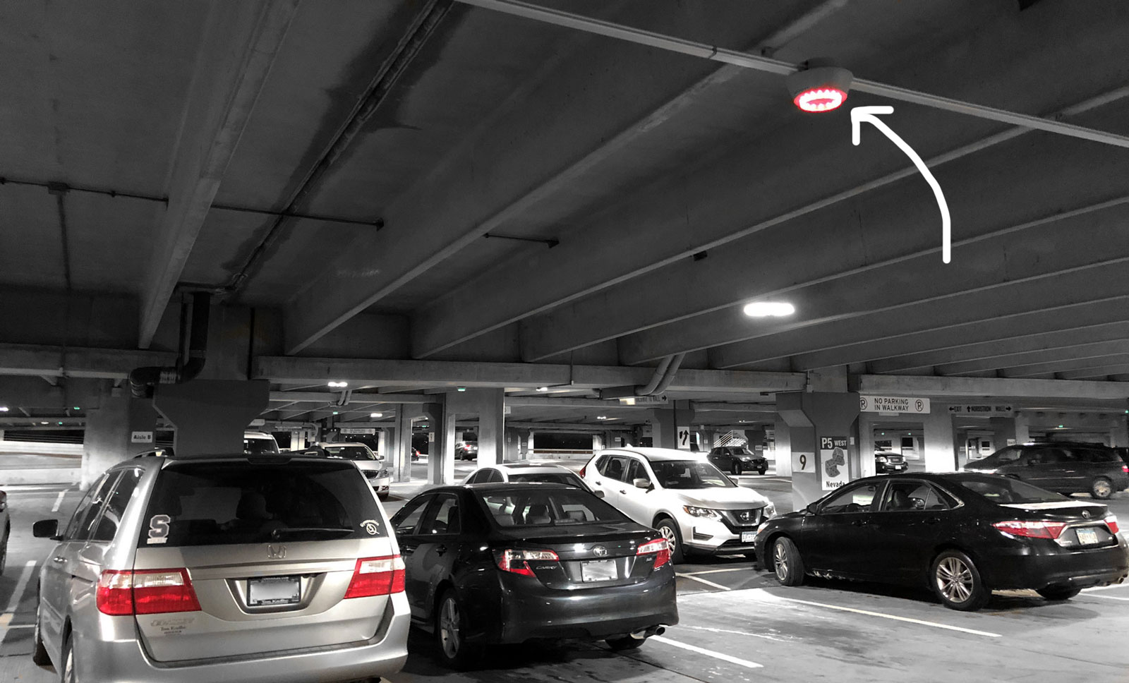
The best thing about this new technology can be found right above the parking spots. As you look down each row, you’ll see blue, green, or red indicators near the ceiling. The blue indicator shows where the accessible parking spots are. If you see a green indicator, it means there is an empty spot nearby. A red shows that the area is full. It’s not a 1 to 1 system, but it’s easy to find the empty spot near the green light.

I would not be a true UX professional if I didn’t automatically try to improve on what was done. I immediately thought about accessibility. The people around me must have thought it was a little strange that I was taking pictures, but I experimented by taking a black and white photo and I did not see a lot of contrast between the different light colors. The lights were green, red and blue. What if a guest cannot differentiate between the colors? It greatly limits the benefit of the design.
One way to improve it is to have different light patterns for each color. For example, red could have every other bulb on to mute it a bit since it’s indicating that spots are full. Is there a way to make an “x” pattern on the red (something that you could see at a distance)? Could the green and blue brightness be noticeably higher than the red?
Overall it’s a great addition to the parking ramps, and now I’m more likely to go back. I was curious about how quickly the color changes after leaving the parking space. There must be a great motion sensor. As soon as we were out of the space, the indicator turned green. Hopefully, other parking ramps adopt this same technology. It’s great when you can save time and eliminate some stress.

Leave a Reply