Project Description
The Engage conference is a annual event focusing on customer experience. Attendees learn how technology is driving and transforming the customer experience. Multiple tracks and influential keynotes make this an event that customer experience enthusiasts do not want to miss.
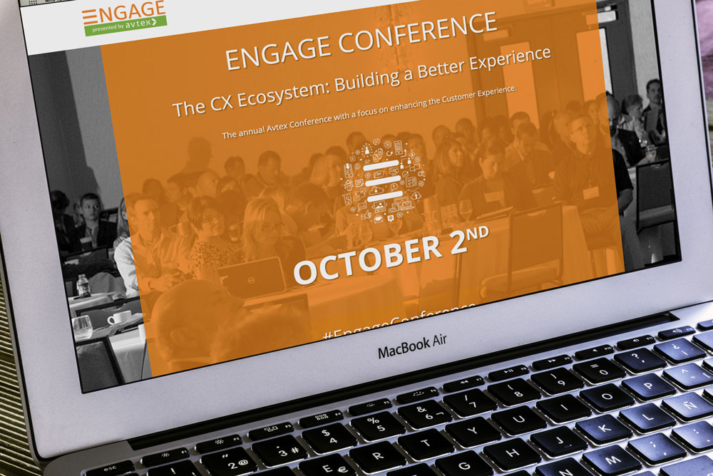
Engage is known for its colorful decor, and each year it changes to keep things interesting. The website served as the introduction to the new swatch that year. You’ve probably have heard the saying “let’s go out and paint the town red”. The goal was to “paint the conference center orange”, but not use actual paint of course. It was a neutral space, which was to be expected (most conference centers are), but really needed to be livened up to set the tone. There was a lot of orange on the website and during the day of the event.
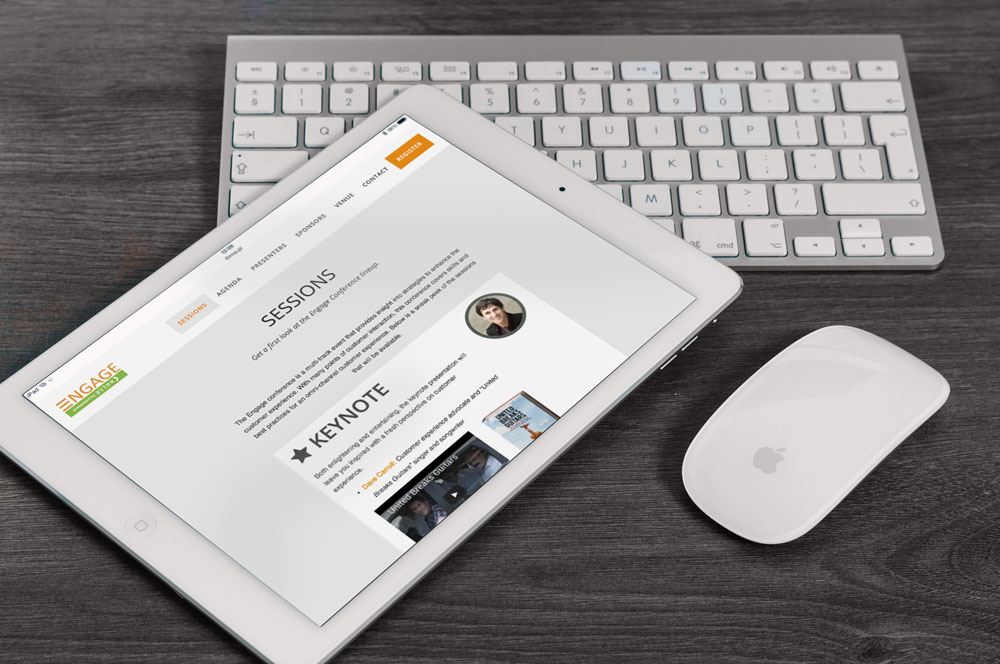
For the event, a microsite is necessary for pre-event registration along with helpful information for session details, schedule, contact details, and more.
The Challenge
The theme was “The CX Ecosystem: Building a Better Experience”. This was a perfect theme for the conference since customer experience relies on an interconnected system of technologies to be successful. This theme was very apparent in the conference tracks. There was a Customer Experience (CX) and User Experience (UX) track, Contact Center track, Business Intelligence, and Technical Insight track.
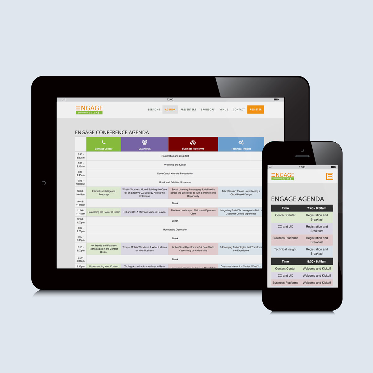
Each track had it’s own color, which had to coordinate with the “Engage orange”. Yes, it’s true that nothing rhymes with orange, but there are colors that coordinate with it. Having different track colors was helpful at the event. Signage reflected the track colors and used the chosen icons.
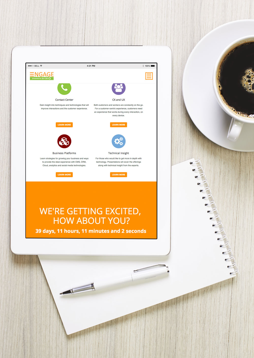
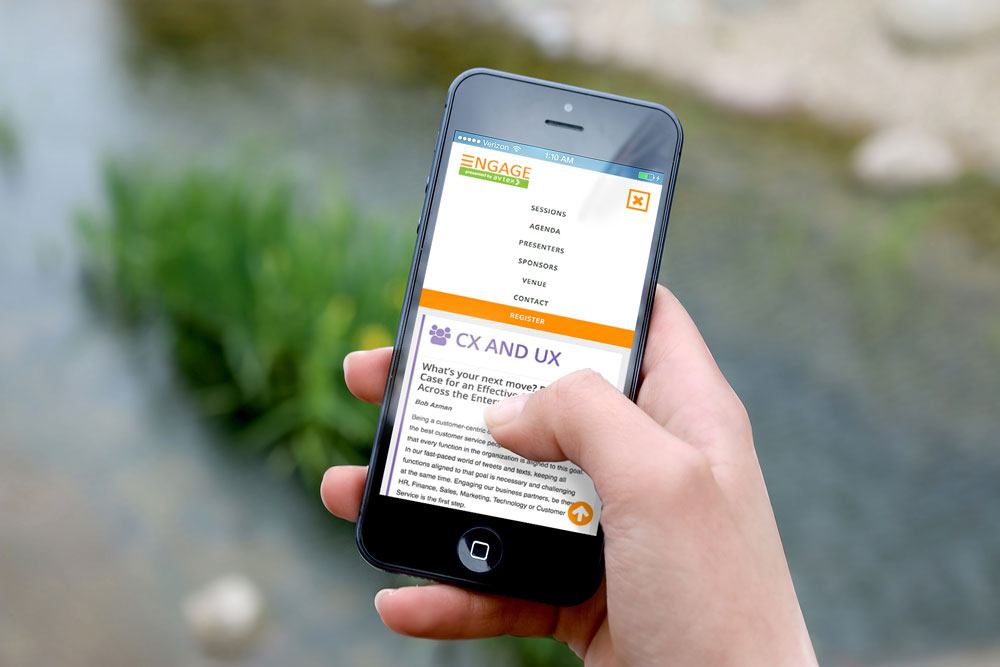
The website was focused on making important information about the event easy to find. At the event, most attendees were on their phones, so it was important that they could easily find the conference agenda and other important information related to the event.
Project Goals
It is important to keep the site updated both before and during the event. As new influencers were scheduled to present and sessions determined, current information was key to registration. It’s normal to have last minute registrations, but it helps get a count early in the planning process (as much as possible). Year over year, this event has grown steadily. By making sure there was a site available early for social media sharing, email communications, and in customer conversations was helpful in getting the record breaking registration.
Site pre-event goals:
- An easy registration process
- Way to generates excitement before the event
- Provides information about conference tracks and sessions as soon as it is available
- Gives attendees clear directions to the event
- Out of town attendees could easily book room at venue and also get helpful transportation information
- Countdown to event
Day of event and after event site goals:
- Sponsor links to show appreciation for their support
- Clear agenda on mobile devices with clear indication of start times and session content
- Information about session presenters was easy to find
- Way to link to sessions and presentations after the event
Role in Project
The site had good feedback, the registration process was simple on the attendee end. The marketing team, who was in charge of the event planning, was able to share the link and also received positive feedback. Before the event, it served as a way to keep attendees in the loop and also the registration process was simple. The contact form tied in with a CRM system which really helped with reminder emails to attendees and also reminding previous attendees to register.
The marketing team was instrumental in planning the whole conference. It was a big, but very fun job. I was fortunate to have a large role in this project. It was a dream project actually, and it was great that feedback was very positive both for usability and visual design. On this microsite project, I was the visual designer, front-end developer and also got to write a lot of the site content. Basically I had to launch and keep this site updated. With proper planning, the timeframe was very reasonable. Starting early gave me adequate time to carefully plan and experiment with the visual design and development execution.
Tools used for the project:
- Adobe Illustrator/Photoshop for style tiles (not much to show for style tiles, design was done in the browser for the most part)
- Minimal php (“includes” to build templates)
- Bootstrap
- Simple vanilla JavaScript
- jQuery
The Approach
Teamwork and proper planning was key
Working together to plan the event and stick to a schedule was key. Brainstorming event details, theme, session, giveaways, etc. was helpful when creating the microsite. I was fortunate to have coworkers who provided session details and anything else that was needed for the site as soon as they had them. We were all invested in the success of the event and providing an excellent experience to all who attended. Getting input and asking for user feedback was crucial to the site’s success. The conference agenda, keynote and other key information needed to be easily found on the site so we could meet (and exceed!) registration goals.
