Project Description
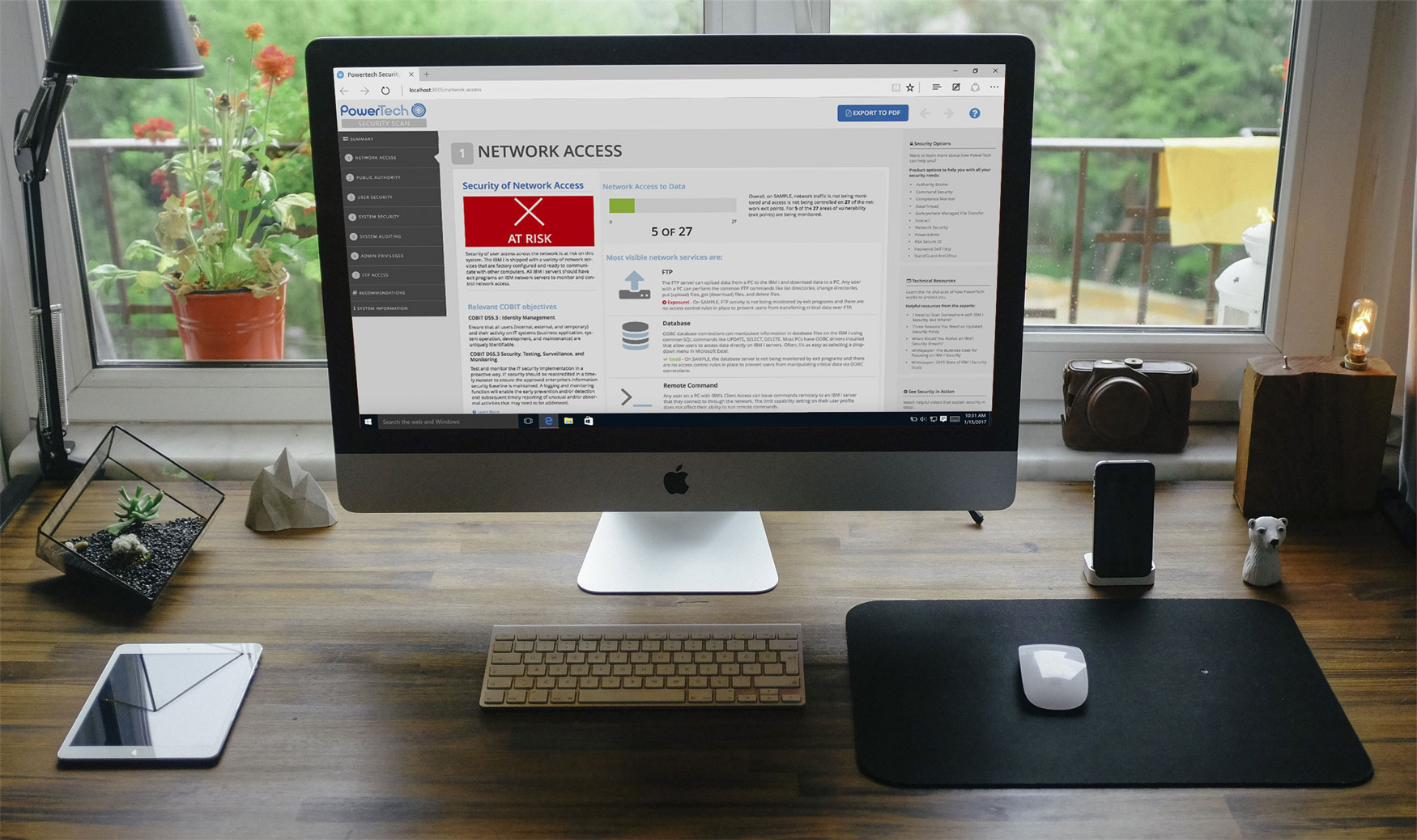
The Powertech™ Security Scan helps identify, quantify & prioritize vulnerabilities on the IBM i. This is a first step when creating security plan. It takes a snapshot of the system very quickly (about 10 minutes). By utilizing report data, it will contain information on where the IBM i security currently stands, whether system is at risk, and how to improve data protection. The will be a clear understanding of where the system is secure and the areas that need work.
It is simple and convenient to run a scan, because it runs directly from a network-attached PC and no system settings need to be modified. Confidentiality is top priority; only the client will see the results. It audits common security metrics and displays the results in an easy to access browser-based application. In addition to viewing data in the browser, there is the option to download the results in PDF form. This PDF serves as a way to share results and print for record keeping. A Powertech™ Security Advisor provides a personal session to help interpret the results. Between the scan and the Solution Advisors advice, there will be a plan in place with the suggested steps to protect critical data.
The Challenge
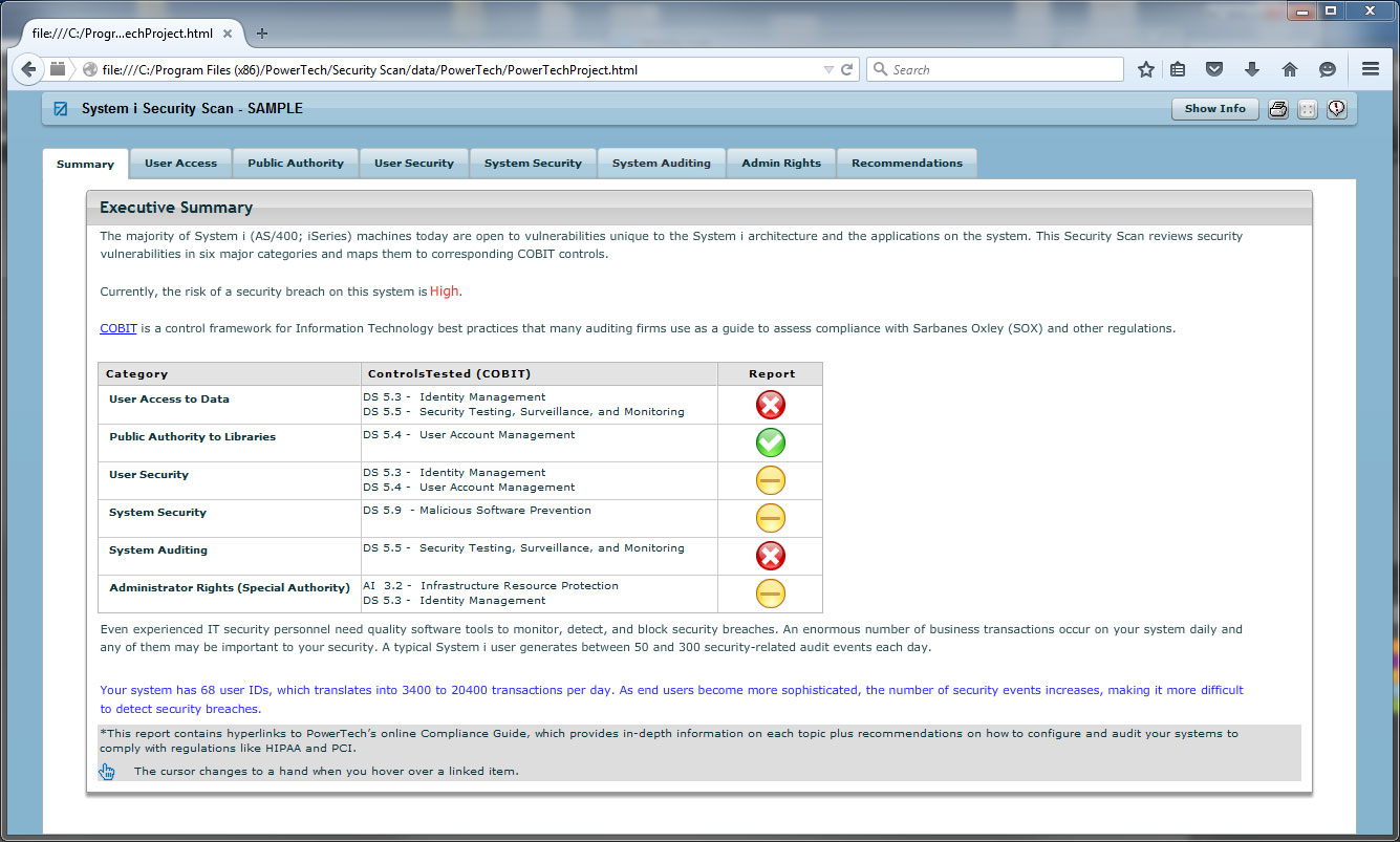
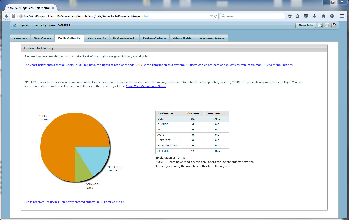
This product was in need of a dire experience overhaul. Time was of the essence, many customers were not able to view the Flash based report due to lack of browser support. This did not provide a good customer experience because it did not give a good first impression (often this is the first product potential customers use) and the Security Advisors needed an updated tool that would provide their clients with an informative security report so they can start on their security plan.
There was minimal time spent on mockups, most of the project was designed in the browser. There was time involved in designing the PDF portion of the report.
Documentation was written as a reference guide when presenting options to management and sales.
Project Goals
In the beginning of the project, these were identified as the goals for the project:
- Eliminate Flash dependency
- Updated visual design
- Enhance usability
- Easy to interpret scan results
- Easy to share report (PDF)
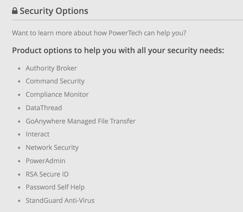
- Related solutions and resources links
UX/Development goals were also addressed:
- Maintainability as company grows there is a good chance that a new designer/developer may work on project
- Design patterns for consistency
- Sales and customer feedback
- New content to be easily added
Role in Project
I was responsible for the user experience strategy and design of Powertech™ Security Scan. I led the design effort, and produced a workable prototype where the development team could use my prototype code. This saved time and it ensured that the design would look visually correct. There was next to no wireframing, only a basic design mockup to start with. This was an effective way to work because time was saved by working in code and making design adjustments on the go. I had the privilege of working with an awesome development team that was instrumental in getting real scan data to display in this report and update it from an outdated Flash report that customers had trouble viewing. In addition to the web viewing option, they were able to make a PDF download option possible, which is valuable for users because it allows for easy sharing and reference.
Design tools used:
- EJS page templating (produce HTML)
- Bootstrap
- SASS (CSS)
- Node.js/Express.js
- d3.js for charting
The Approach
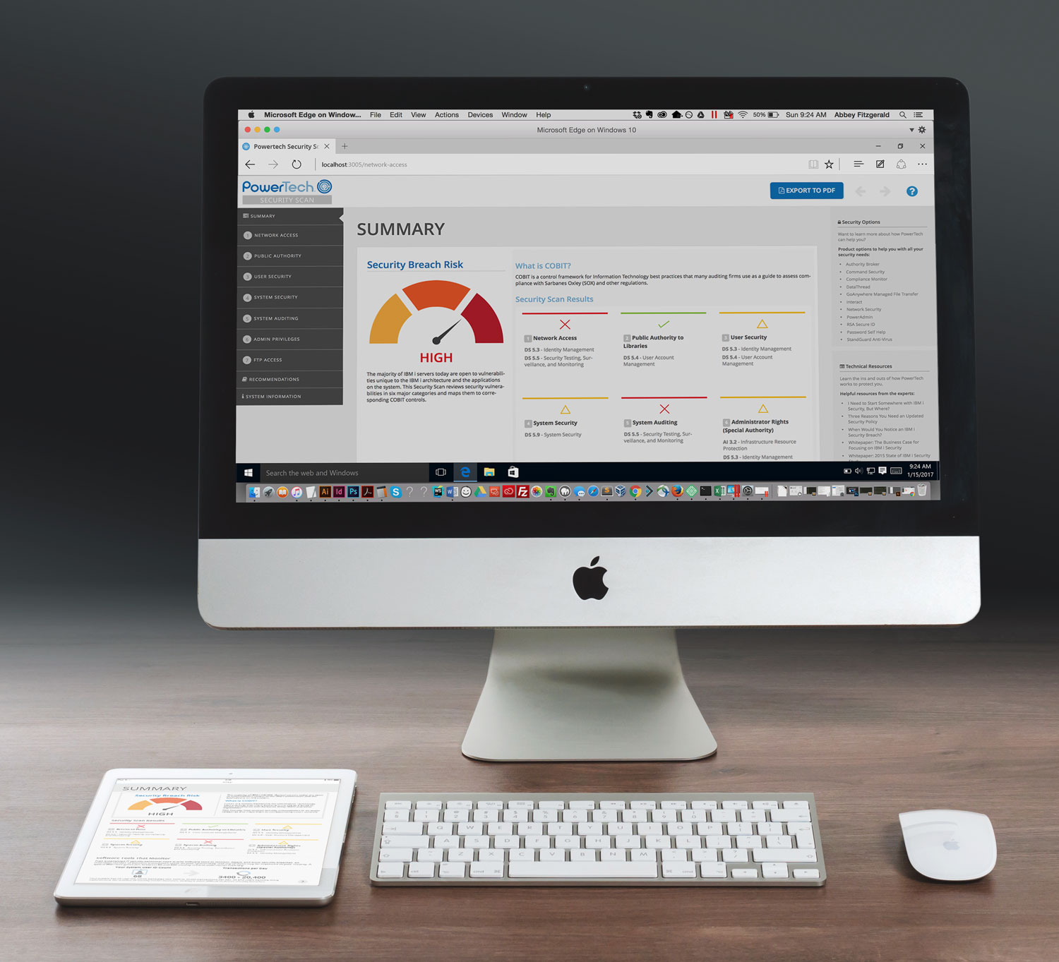
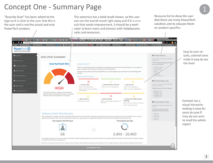
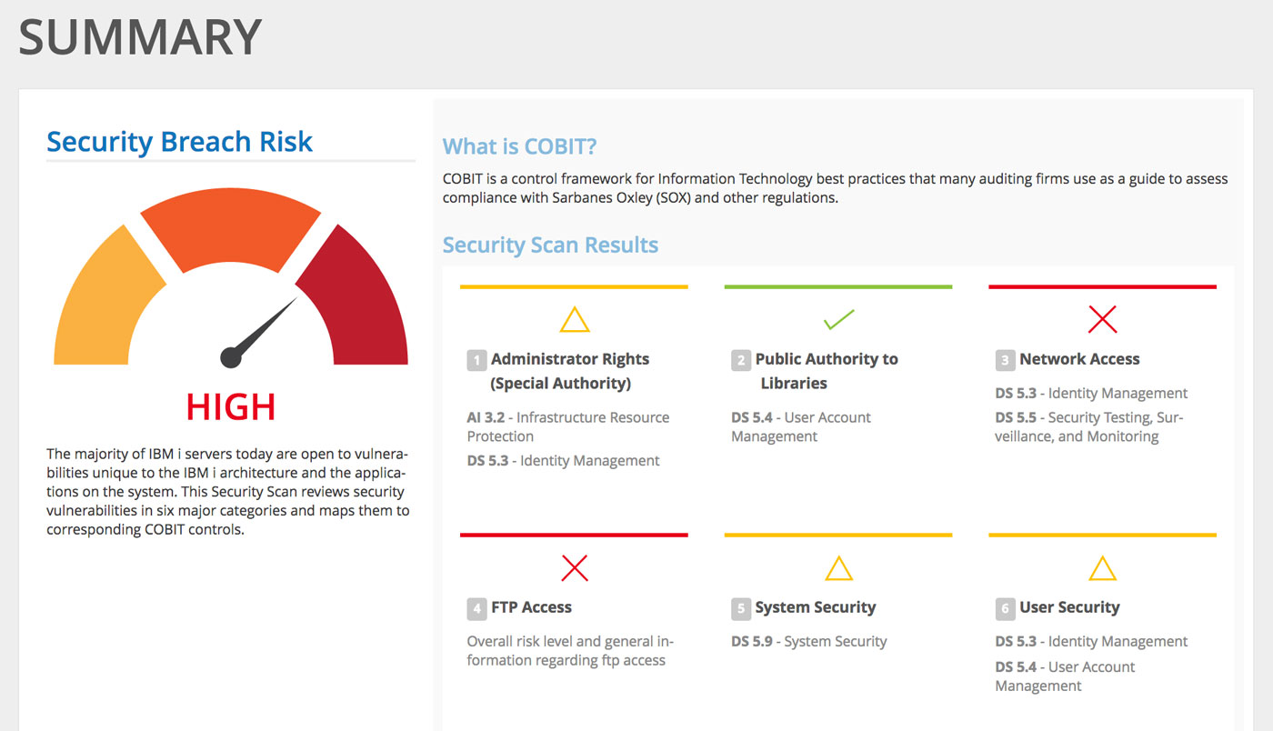
Focused on providing clear and concise display of data so customers can clearly understand security risks
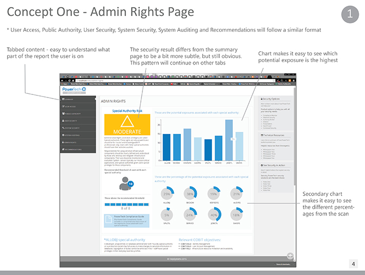
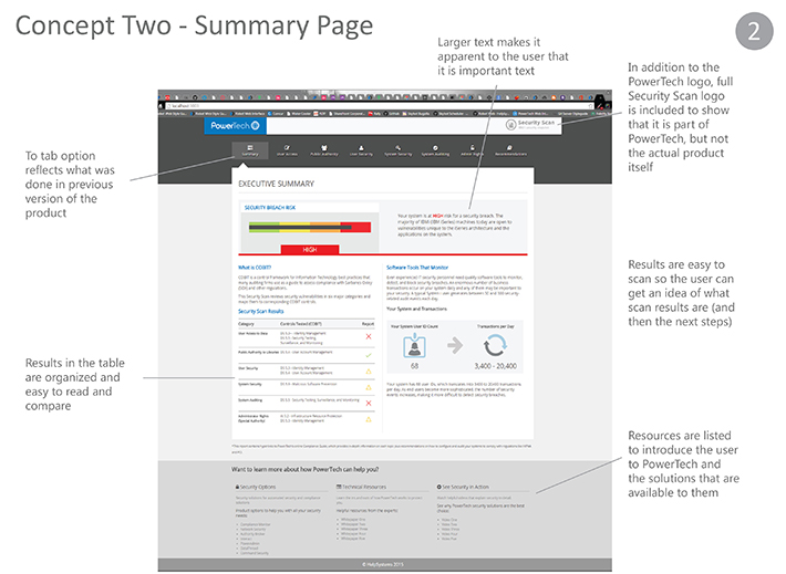
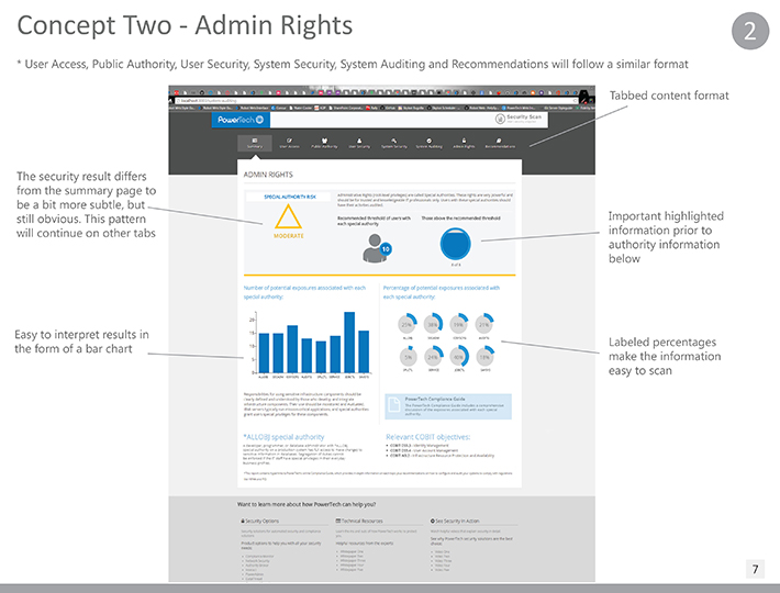
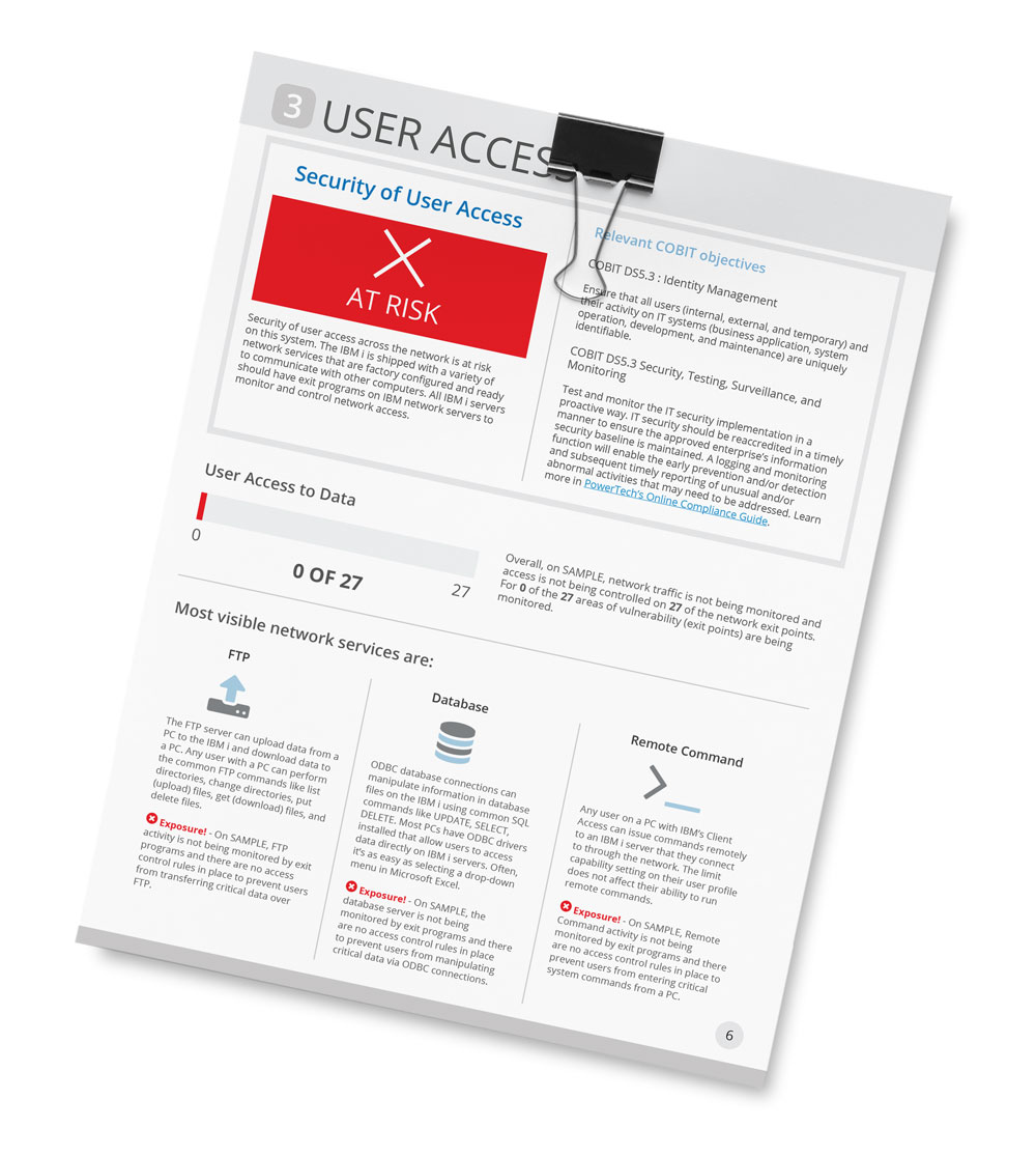
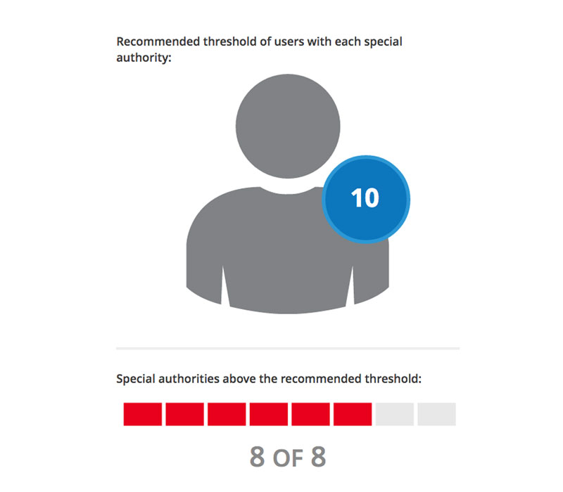
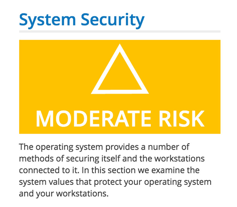
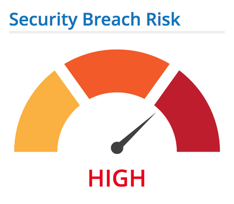
Unless data is easily understood, it doesn’t mean much to the user. Every scan result page has a risk level displayed. This information is very”scannable” for the user that does not want to read everything word-for-word. For users that may not see color accurately, shapes are also provided. That way results are accurate and meaningful. In addition to being aware of color limitations in the web application, there is also the potential that a user may print the PDF in black and white. In this instance, shapes are also important for indicating results.
- Easy to interpret scan results
- Easy to share report (PDF)
- Related solutions and resources links
- Clearly understand individual risk level
- Overall risk level featured
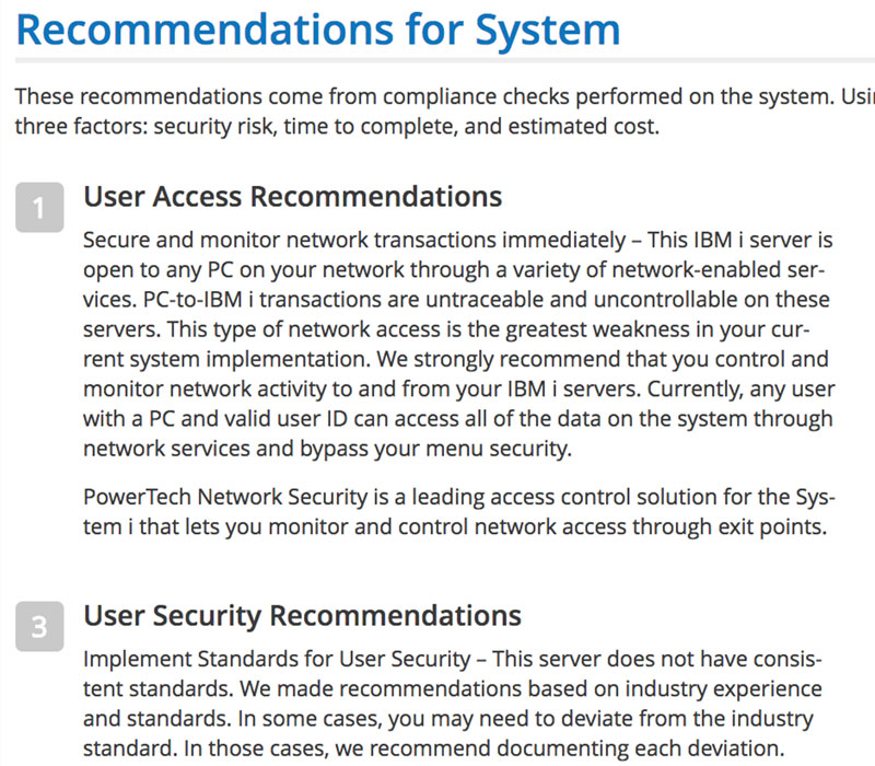
- Recommendations for next steps
Started on the same page
A collaborative effort with management, sales and development
Working closely with management and the Security Solution Advisor who use this tool daily, I was able to get quick feedback and make the content adjustments instantly. Because objectives were clearly defined early in the project, we were able to get this product tested and delivered within a couple months. The design of the product was planned out so when more content is added to this report, the design will account for this. Just recently, more content was added and the content order was rearranged so it better fit the way the Solution Advisor walks through the scan with the client. Because of carefully planning upfront, it was easy to rearrange and add this new content.
Page elements are consistent and follow a certain order, these established design patterns offer consistency and it makes adding new content easy. Later down the road, a new designer or developer may come on board and they will easily pick up on this and will be able to jump right into the project.