Project Description
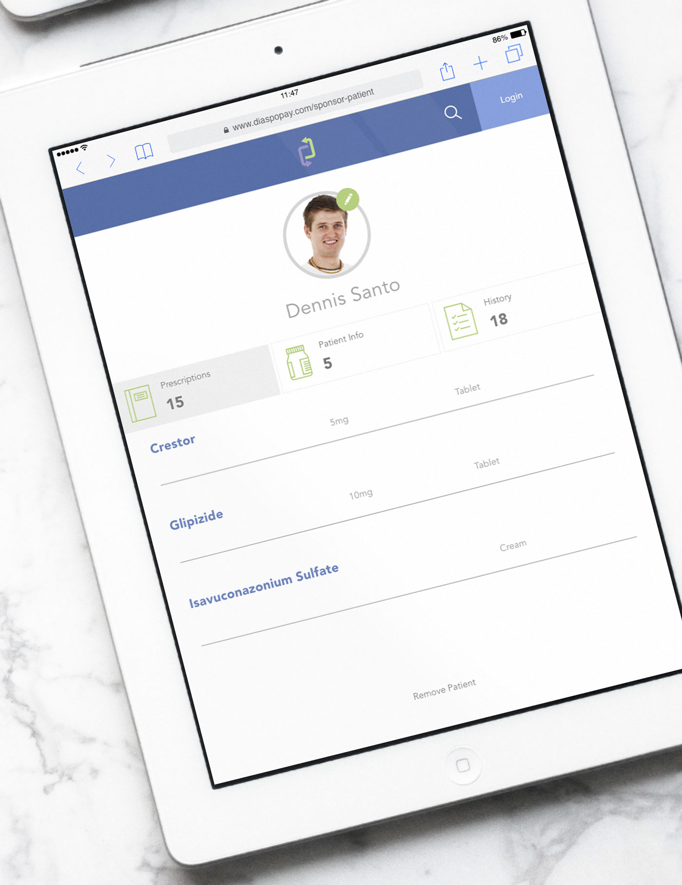
DiaspoPay is a web application where a user registers as a sponsor to help with medical costs for an individual patient of their choice. There are key components to this application. The sponsor can add, remove, modify any of the patient data. They can easily access prescription information and medical records of the patent they sponsor.
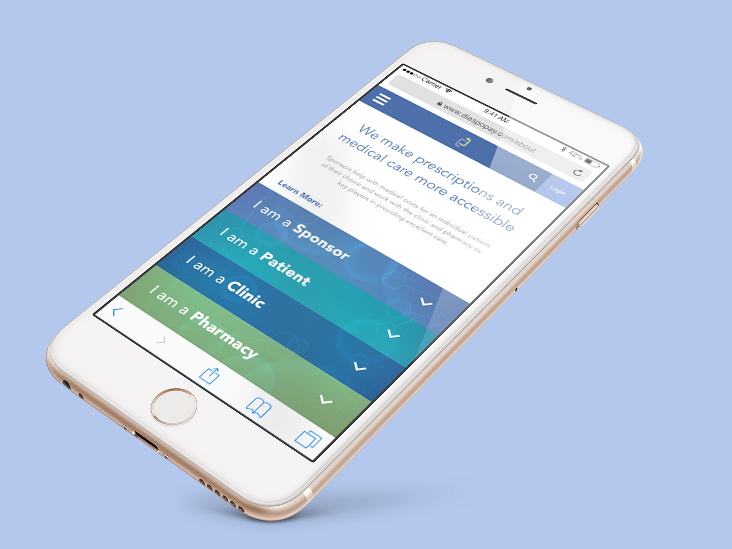
DiaspoPay’s mission is to make prescriptions and medical care more accessible by allowing funding for patients who do not have the financial means for the services they need in Africa and other developing countries. This efficient way of transferring funds allows for the sponsor to contribute to the patient to get the medical care they need.
The Challenge
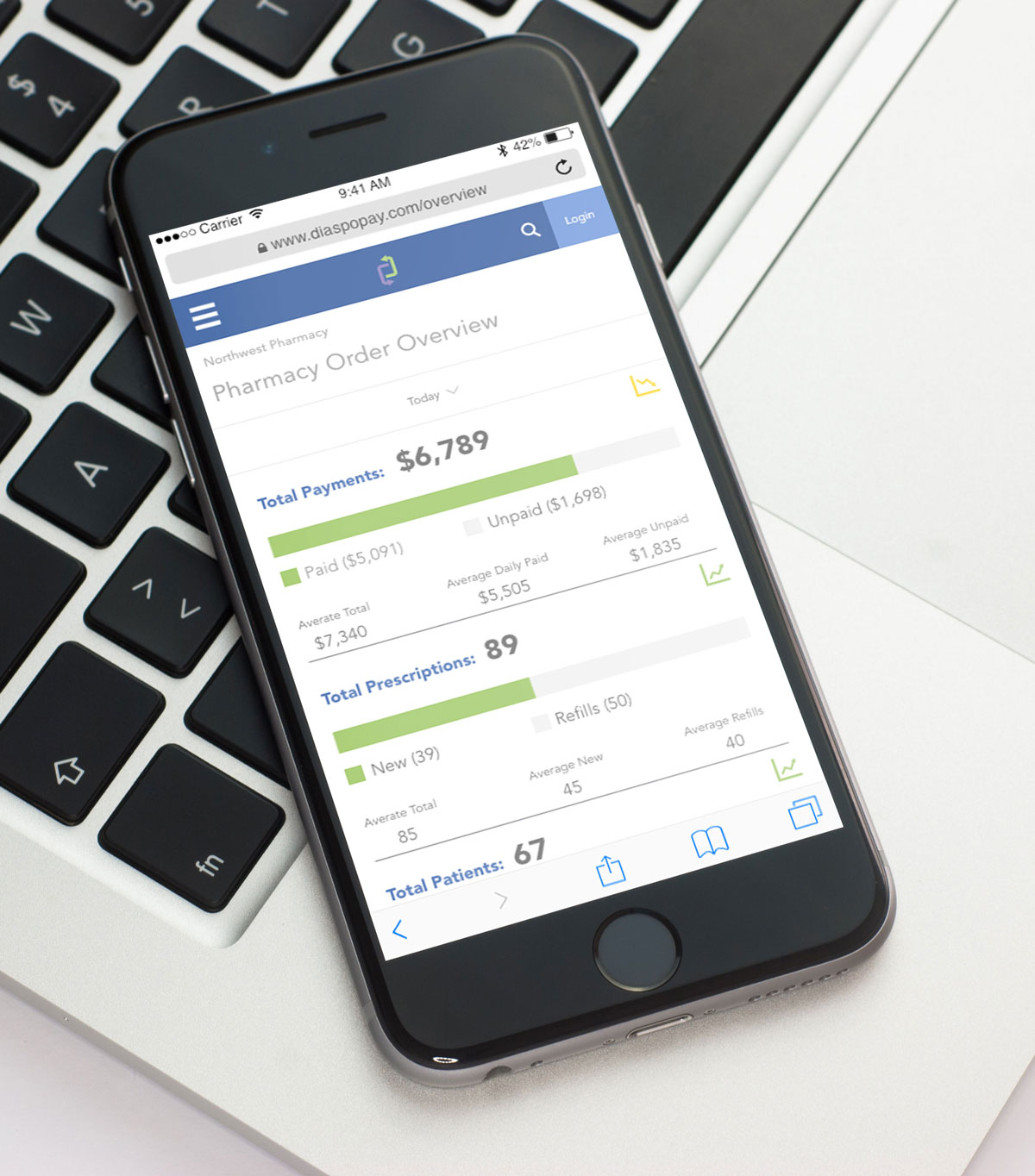
This is a very robust system, based on various user roles. Because this application is so role specific, it is necessary to create something that can display the needed data for each role and also provide a separate login and dashboard for every user. DiaspoPay maintains the complete database of users, patients, hospitals, pharmacies and also maintains the billing and medication records.
Important: Security is top priority and follows HIPAA guidelines.
When doing research, these were the four persona types:
- Sponsor
- Patient
- Clinic
- Pharmacy
Project Goals
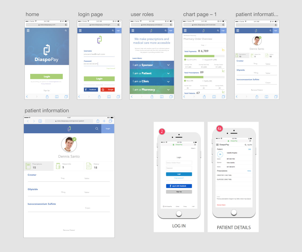
The “minimal viable product (MVP)” was responsive a web application for the sponsors, pharmacies, hospitals, and also for the actual patients. The MVP was used to present the idea to investors. The goal was the have a functional, well planned, and aesthetically pleasing product to show.
There was a lot of UX planning involved in the beginning stages. The team had the lean mindset, so it’s safe to say that things will definitely change later on. User flows were well planned out, branding started, and technical plans were solidified before the bulk of the development work was done, which was the goal before the MVP launch date. The important thing was that every user role could complete their needed tasks so investors could fully understand the capabilities of the product.
It’s pretty easy to see the writing on the wall for the future plans of the product. The MVP served as a “gateway” for the native aps that will be built in the future. The web application is crucial to the product roadmap, but users also want the convenience of working with a native ap. Careful consideration was given upfront to ensure the web ap can translate into the native aps when it is time. Building a strong foundation for the native applications, will save planning time in the future.
Role in Project
It was a project where was excited to “wear many hats”. I worked on visual design for the product launch before the product was shown to investors. Working with another UX designer, I adjusted wireframes as needed but focused on creating content and UI elements while working on the front-end portion of the MVP. UX opinions were definitely welcome from all team members. I could not completely stay out of the UX on this one, old habits die hard. I was “second in command” so I did contribute to some of the UX on the project.
The Approach
Mobile Focus
The design had to be simple and in the modern web design world, it can be tempting to create a sleek, image heavy design. The web is full of beautiful large, welcoming hero images. However, for a lot of users, this would not be an idea experience. Performance conscientious design was an absolute necessity because in some locations, internet bandwidth may not be high. For example, Opera and UC popular browsers in Africa. It’s important to remember that as of right now, there isn’t the same number of high performance phones and huge internet data packs that are available here in the US. Internet speeds may not be fast in all areas so this application accommodates those users.
After the prototype was built, it was important to stick with the basic design moving forward. In the future, there is a lot of opportunity to create more of an image based design with careful targeting and testing but at the launch stage it’s important to keep perfecting the experience based on user feedback. Keeping the design relatively basic and designing with images that are nonessential to the experience if they cannot be downloaded, is top priority. On older devices and browsers, there will be a fallback so unnecessary downloads do not occur.
Branding
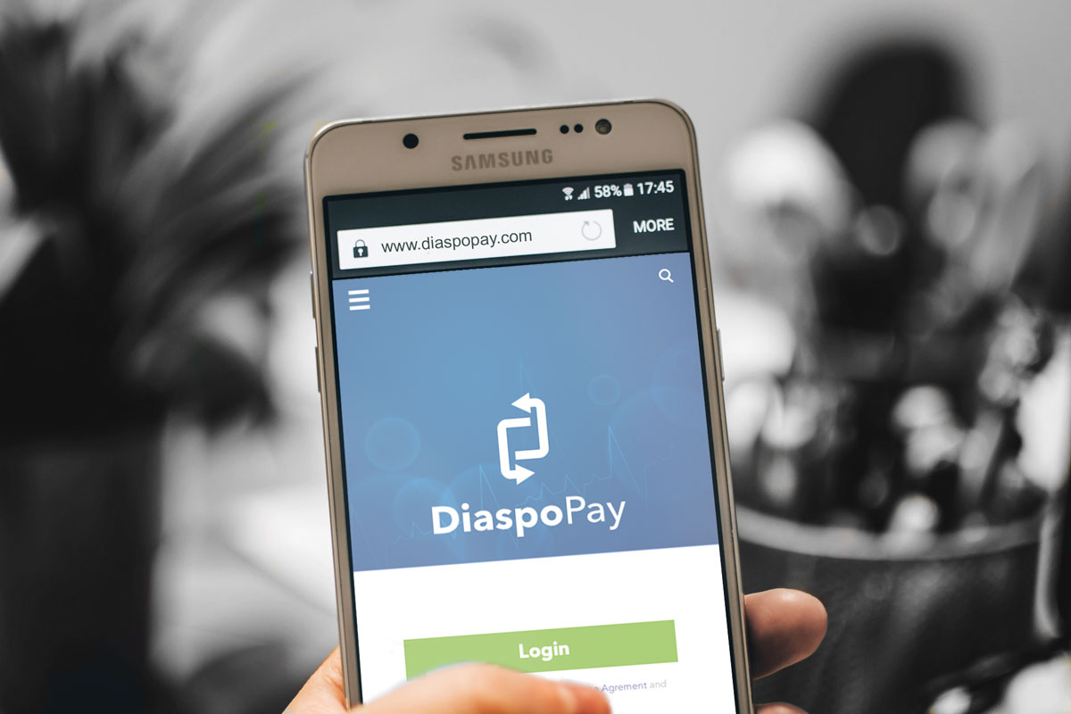
The logo was designed to represent the connection between the sponsor and patient and the patient and provider. The arrows represent the payment and service cycles that the application provides to users. The negative space also has significance, the initials can be found in the logo.
![]()
Color selection can be challenging since different colors can mean different things in various regions. I didn’t want the design to look too “medical”. To start things off colors were kept basic, as some brighter, bolder colors may have too strong of a feeling associated with them.
Easy to interpret data
From a sponsor and patient point of view, interactions are clearly indicated and it’s apparent how to complete needed tasks. From a pharmacy and clinic perspective, easy to interpret data is key. It is important to know both patient and business statistics.