Project Description
Avtex needed documentation that outlined brand guidelines and visual rules to maintain identity. This document, served as a great starting point and was able to grow with new content as required. Starting small, the branding basics were established and guidelines were clearly outlined.


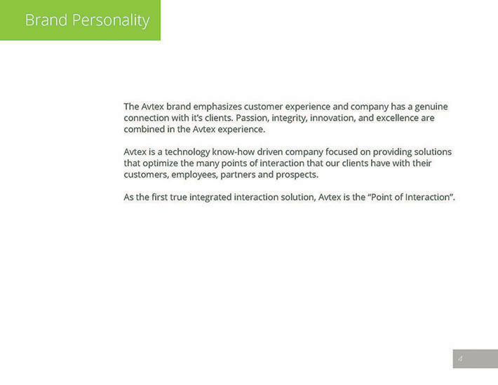
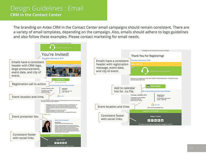
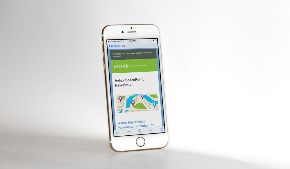
The brand standards document is the basis for establishing rules so the company brand is unified and identifiable. Things like logo use, brand colors, company letterhead, presentation slides, email communication recommendations, and more were documented to start with.
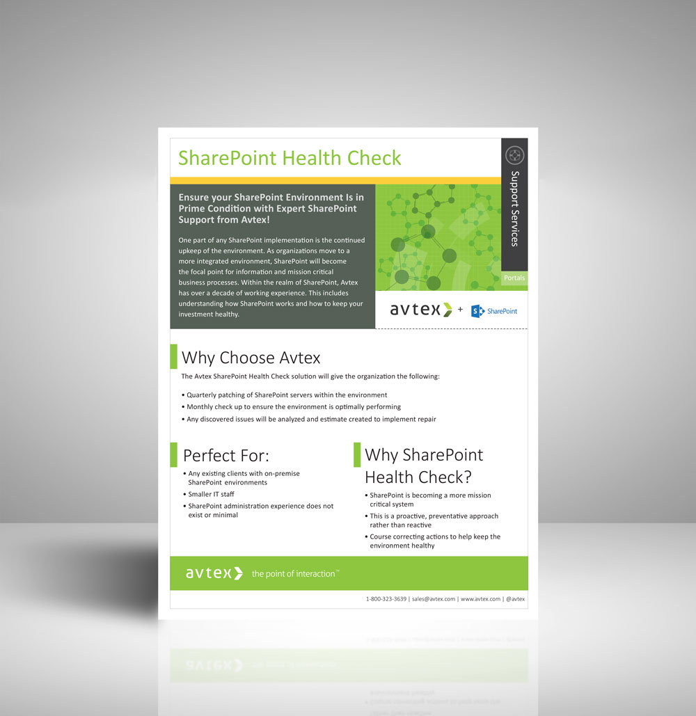


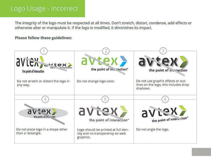

Expandable and an ongoing document that included thing like:
- Overview of brand, including history and vision
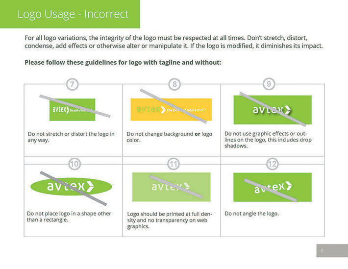
- Logo specifications and examples of usage
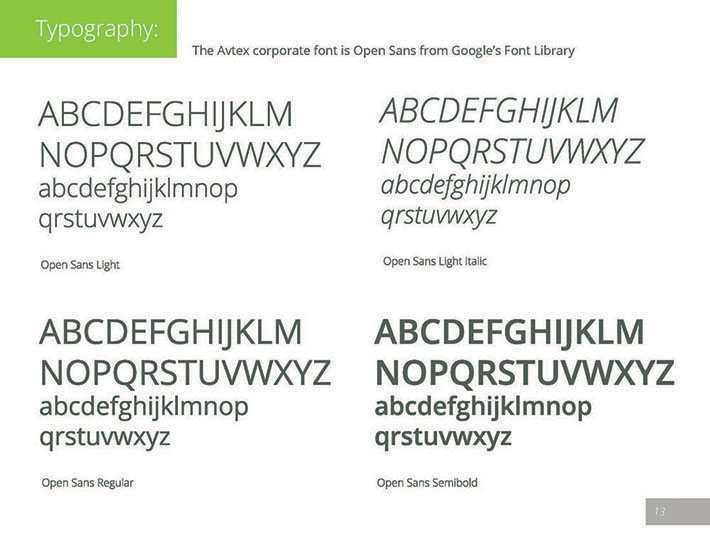
- Typography palette
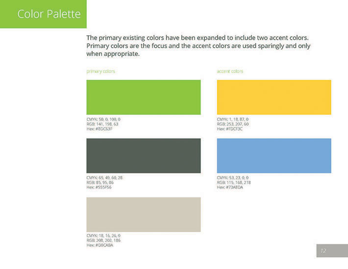
- Color palette
- Letterhead and business card design
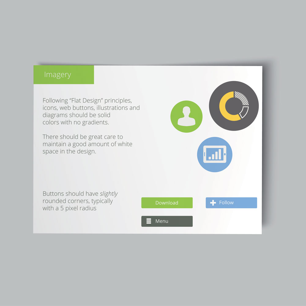
- Design layouts and grids for print and web-based projects
- Brochure guidelines
- Visual examples to support rules (in many cases, provide examples of proper and improper use)
The Challenge
Making sure things were clearly defined so it could be used by everyone in the company was both important and challenging. Not Each marketing channel was not necessarily relevant to each person in the company; making the important information easy to find was necessary. There were many different types of communication, and because this was a starting point, not everything was included in the first few versions.
Another thing that was a challenge was actually promoting this. What does it offer? Why should employees even care about it? Making a convincing case was important and explaining the benefits of consistent branding was necessary at launch time. Not everyone is familiar with this type of guide, so it was important that it was easy to access. Posted on the company’s intranet was the best place for it.

Luckily, it was well received. Fellow co-workers were excited to have something like this, appreciated branding unification, and were able to find what they needed in the guide.
Project Goals
The ultimate goal of this guide was to create a distinct and unified presence for the brand with a plan on how to add to the guide as needed. The focus was creating an easy to use guideline that was easily understood, so there would be consistent branding throughout the company.
This was the list of specific goals:
- Maintain the integrity of the logo across multiple platforms. This includes how the logo is to be used, from placement to acceptable alterations.
- Document was a visual guided starting point to establish good branding habits, but being open to the conversation and being the design resource for the project was just important.
- Guide for designers as well. This was something that could be utilized by contract resources.
- Defined corporate typefaces and styles for unified typography.
- Clearly defined color, each by name and color value for a variety of projects. Primary, secondary and alternate colors for the palette. Defined color with values for print (CMYK) and digital projects (RGB, HEX).
- Color palette that outlined each color and how it should be used.
- Making sure the importance of the document was conveyed and that it was a necessary resource for anyone creating marketing materials.

Role in Project
Responsible for creating and maintaining the document. Ensured marketing materials followed the guidelines so accurate examples could be shown. In the beginning served as the “branding saleswoman” to help show and explain the importance of consistent branding. Served as the design resource for any branding questions and suggested improvements.
Here are some freelance articles I’ve written about the subject:

Leave a Reply